Search results pages designed by Adam Maulvi
Header and quick search designed by Josh Keenes
The challenge
Previously, the search function was minimal. Although the search bar was visible, it was tightly squeezed into the navigation. Users could type search queries, but only quick results were shown, which were often inconsistent and frequently led to broken pages. Pressing the search button or the enter key elicited no response.
The solution
We identified two key areas for improvement. The first was the position of the search bar and the quick results panel, which Josh addressed. The second involved introducing a new search results page where users could view and filter items, considering how queries and logic would impact the page's presentation, which I undertook.
The process
1. Analyse data and analytics
2. Study research and best practises
3. List pages needed with search logic applied
4. Create desktop and mobile designs
5. Discuss designs in a refinement session
6. Update designs based on feedback

Dwell on the data
Based on experience and best practices, we knew we needed an intelligent quick results panel and pages. However, it was important to consider user behaviour with the search function. Observing the top searches helped identify that users' search queries were more generic rather than specific, and their interaction with the search bar typically lasted only a few seconds, likely due to a frustrating experience.
Reviewing the research
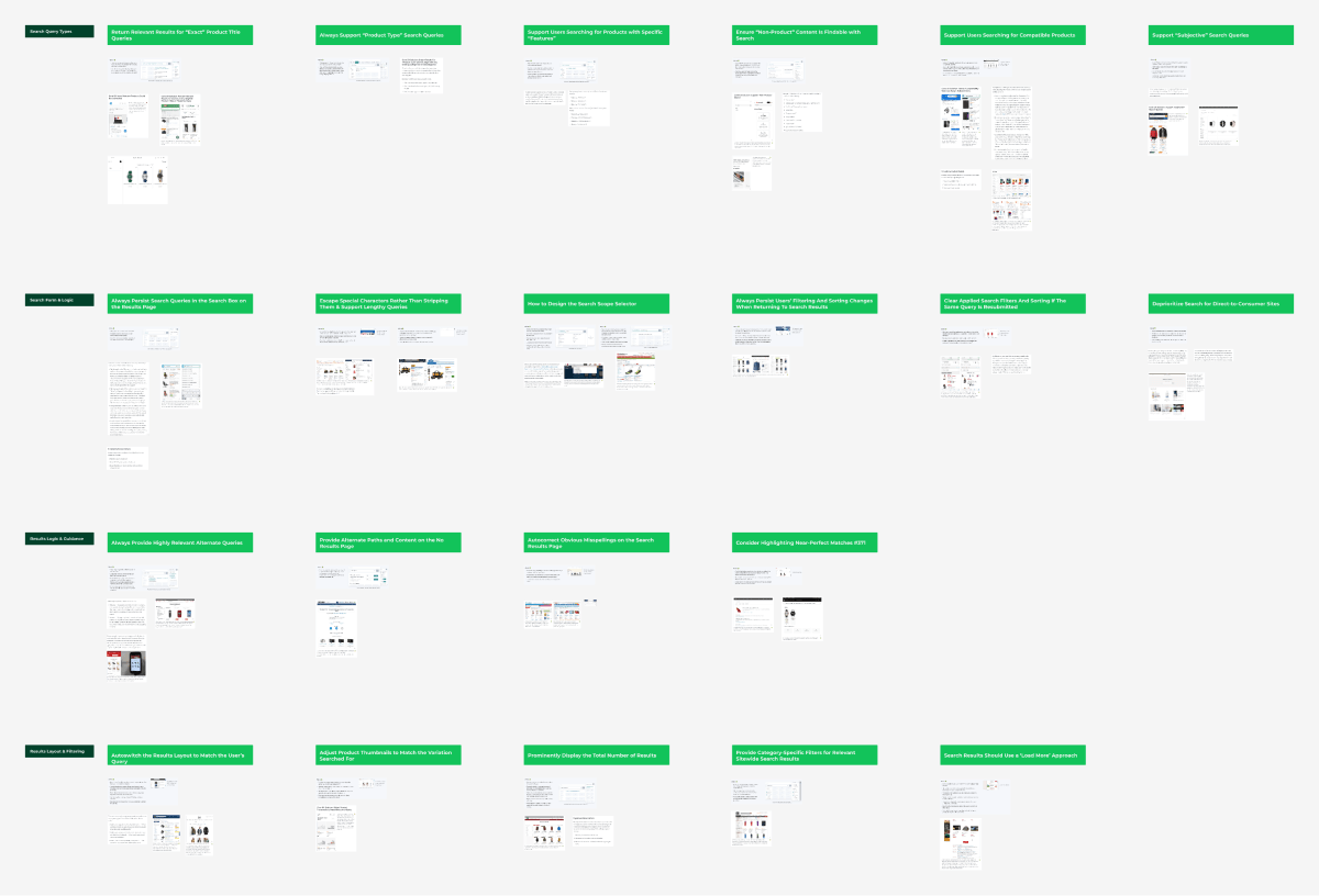
I extracted valuable insights from the Baymard Institute's articles and research projects regarding how to handle the website search experience.

Specifically, for the search results page, I summarised key takeaways from Baymard into four groups. This made it easier to reference when designing and explaining decisions to stakeholders.
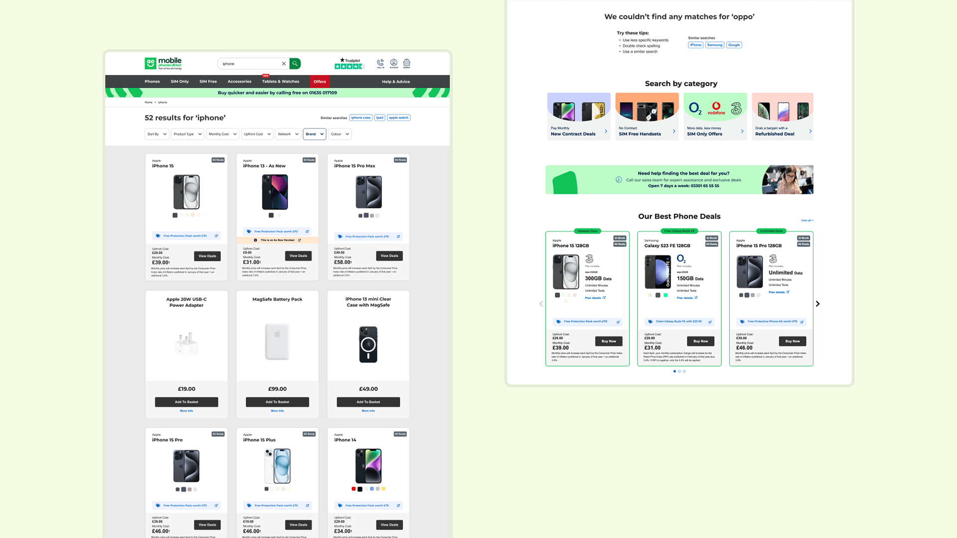
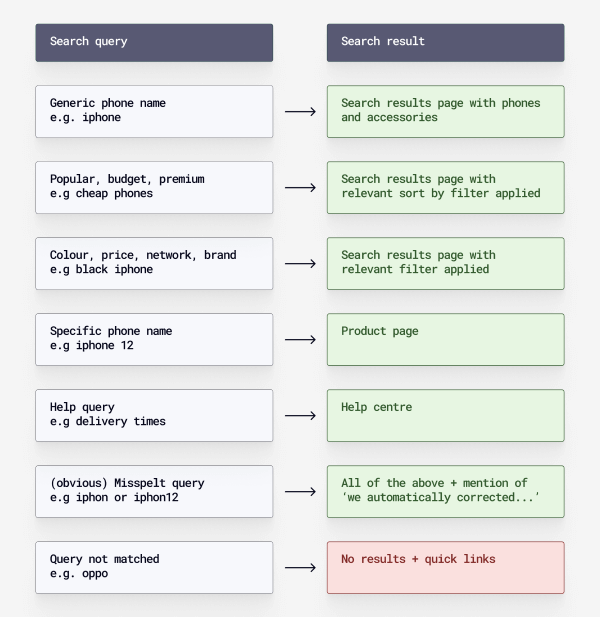
Search queries and logical results
Essentially, all search results would lead to the search results page, product page, help centre, or a no results page. The objective was to ensure that different types of queries directed users appropriately, ensuring an efficient experience through the use of pre-applied filters, quick links, default variants, and helpful information.
Designs

Before
The previous header showed the old placement of the search bar and how typing different queries yielded underwhelming results. There was also no search button.
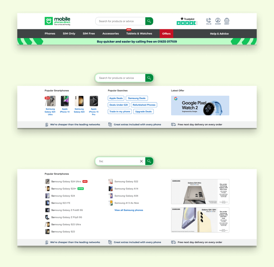
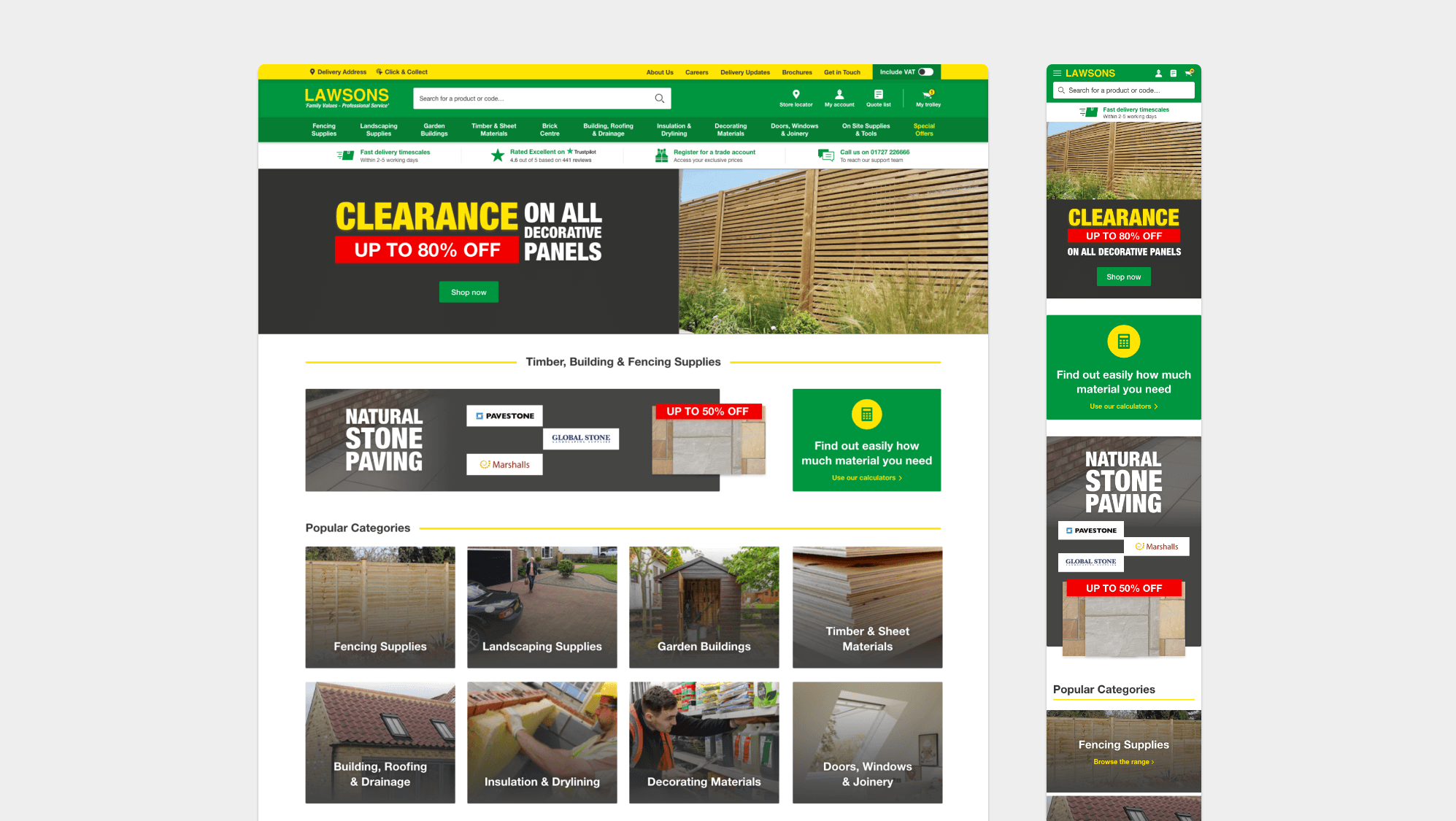
After
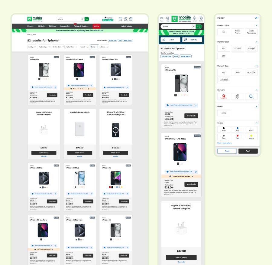
Josh upgraded the header and search panel, displaying results, promotions, and USPs. The aim was to make the quick search smart and versatile, using the search results pages I created as a fallback if someone pressed the button or enter out of habit or because they wanted to view products or information in a larger format.
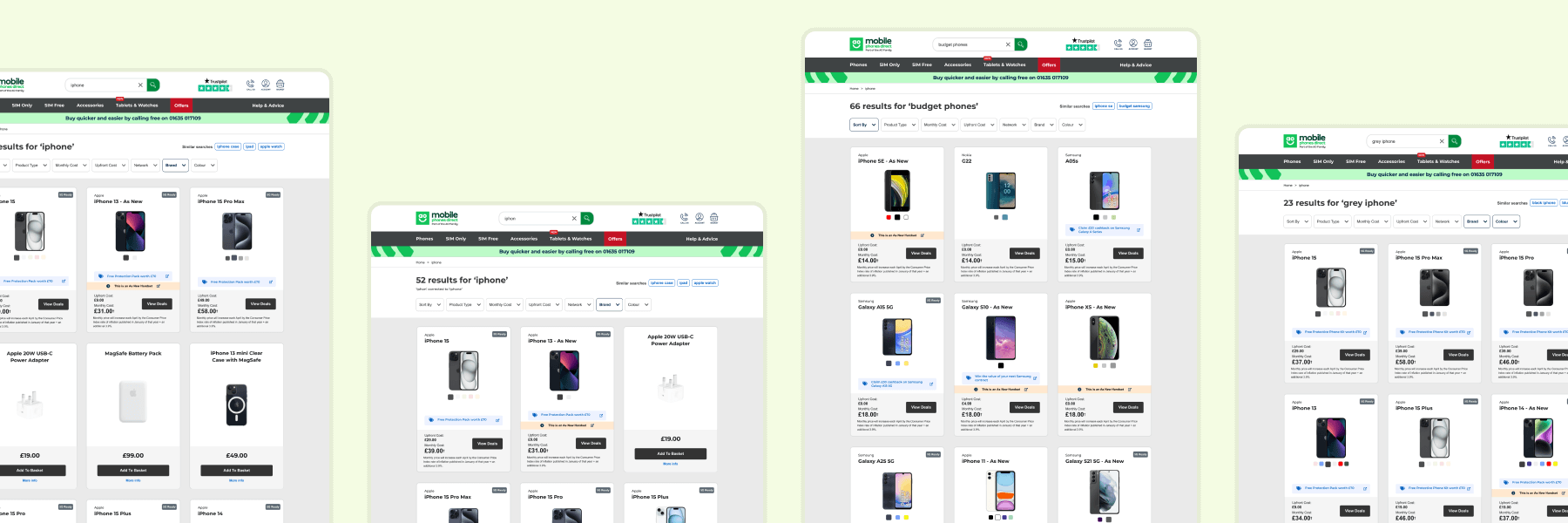
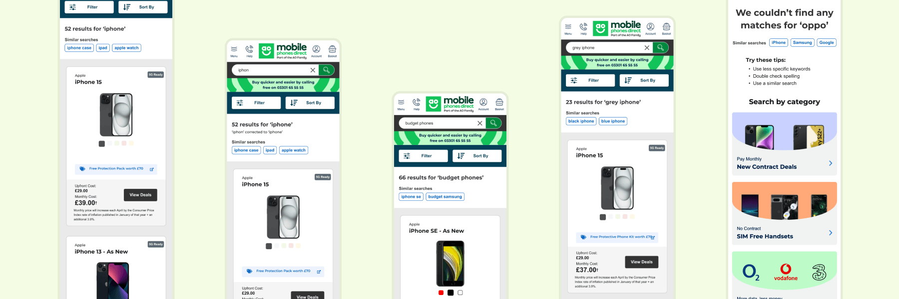
Different search terms would pre-apply various filters where possible. For example:
- 'iPhone' would apply 'Apple' in brands.
- 'Budget phones' would automatically sort from low to high price.
- 'Grey iPhone' would apply 'Apple' in brands, 'grey' in colours, and update all products to display the grey variant and thumbnail by default.
Want to work together?