
The challenge
Upgrade sales for phones and SIMs were falling behind new contracts and SIM only deals. The upgrade category pages lacked engagement, and users often didn’t know if they were eligible. Stakeholders wanted to make upgrades a key focus, but the experience wasn’t driving conversions.
The solution
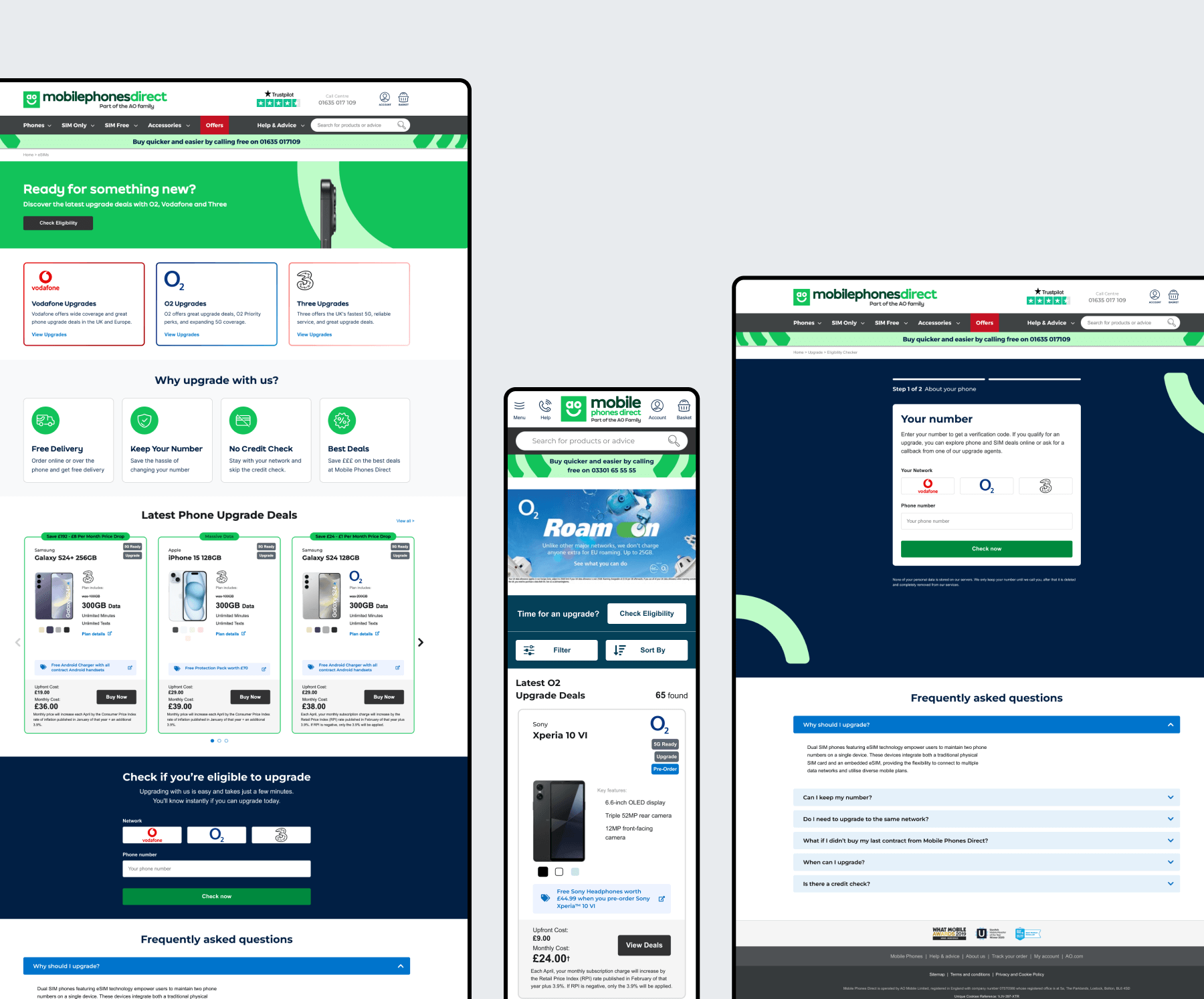
To improve upgrade sales, I designed a dedicated landing page showcasing the latest upgrade deals and their benefits. I also created an eligibility checker form, allowing users to quickly verify their options. To drive engagement, I refined key call-to-action buttons, making it easier for users to navigate to upgrade deals and complete their purchase. This helped boost visibility, improve user experience, and increase upgrade conversions.
Process in a nutshell
1. Analyse competitors
2. Ideate different sized solutions we could incorporate
3. Validate ideas by testing on Userzoom
4. Update designs based on feedback
5. Showcase to stakeholders
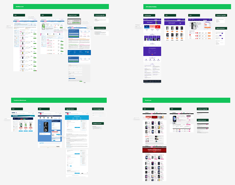
Competitor analysis
Looking at four key competitors, a few insights stood out:
– Each had a dedicated landing page for upgrade deals, making them easy to find.
– Call to action buttons for upgrade eligibility were prominent and encouraged user interaction.
– Most featured a simple eligibility checker form, though visually unpolished. This was an opportunity for us to improve both functionality and aesthetics.
– Call to action buttons for upgrade eligibility were prominent and encouraged user interaction.
– Most featured a simple eligibility checker form, though visually unpolished. This was an opportunity for us to improve both functionality and aesthetics.
Small but mighty
I knew we needed a landing page and an upgrade eligibility checker, but I also wanted to refine the language throughout the upgrade journey. I had the idea to make call-to-action buttons more specific, guiding users smoothly to checkout. I changed ‘Buy Now’ and ‘Add to Basket’ to ‘Upgrade Now’ for clearer intent.
– Tested the change with 100 participants on UserZoom. Over 90% preferred ‘Upgrade’ in the button.
– Over 80% said they were more likely to complete their purchase with the updated wording.
– Key remarks included "It feels clearer" and "It makes the process more straightforward."
– Over 80% said they were more likely to complete their purchase with the updated wording.
– Key remarks included "It feels clearer" and "It makes the process more straightforward."
This was a small, low-cost design change but had the potential for a big impact on upgrade conversions.
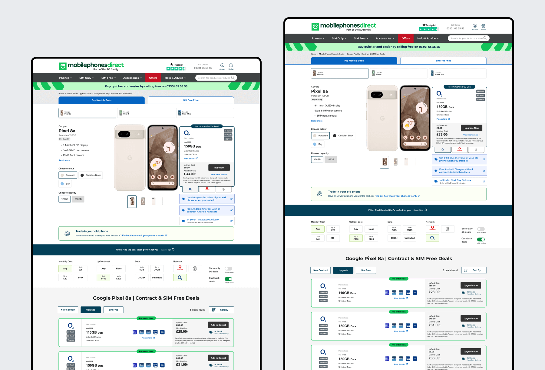
Before and after of call to action button changes from 'Add to Basket' and 'Buy now' to 'Upgrade now'
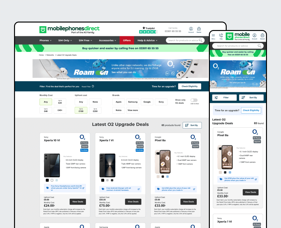
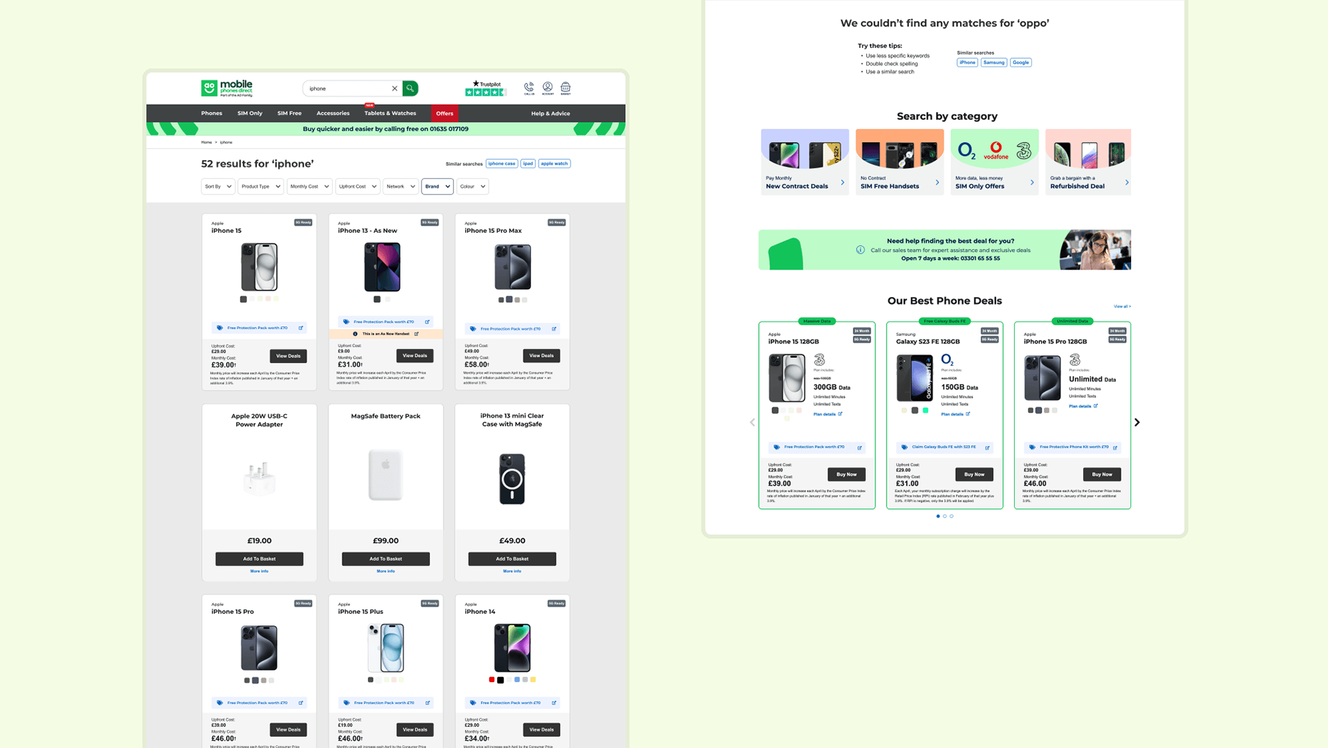
Getting to the checker
The obvious solution was to add a link in the mega menu, but stakeholders felt it was already too crowded. Instead, I placed a prominent call to action on the upgrade deals category pages, ensuring users could easily find it at a crucial stage in their journey. I also adjusted the layout by moving reset filters to the left on desktop and adding a new element on mobile.
– The upgrade deals category pages were a common drop-off point as users weren’t sure if they were eligible.
– A quick UserZoom test showed users found the link obvious and useful.
– Key feedback included "It helps me find out right away if I can upgrade or not."
– A quick UserZoom test showed users found the link obvious and useful.
– Key feedback included "It helps me find out right away if I can upgrade or not."
Failed designs
After sharing the first iterations with stakeholders, peers, and testers on UserZoom, key insights emerged:
– Peers found the use of network brand colours on the landing page distracting.
– Testers felt misled by the form being on the landing page, as clicking the button revealed unexpected extra steps.
– On mobile, the 'Check Eligibility' button placement was unclear and clashed with the filters.
– I tried grouping four form steps into two to make the process feel quicker, but stakeholders found this misleading and preferred clearer progress indicators.
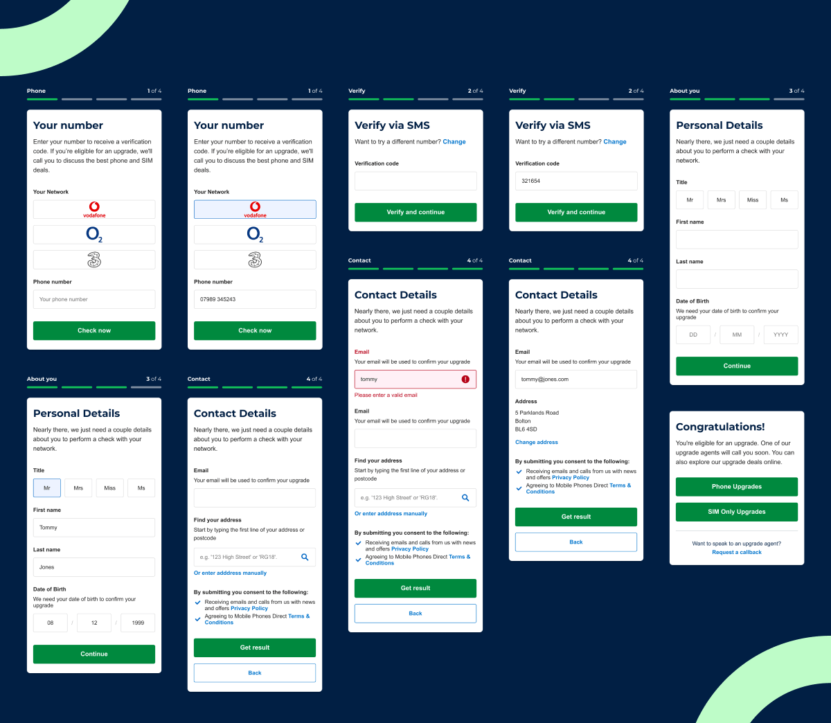
Final designs
Based on feedback and insights, I made several key updates:
– Refined the network boxes for better consistency and page flow.
– Changed the form button on the landing page to a link with helpful information, leading to a separate form page.
– Improved the eligibility checker button on mobile and designed a new element specifically for mobile, ensuring it remained cohesive with brand colours and styling (shown in 'Getting to the checker').
– Enhanced the form’s progress indicators for better clarity and a smoother user experience.
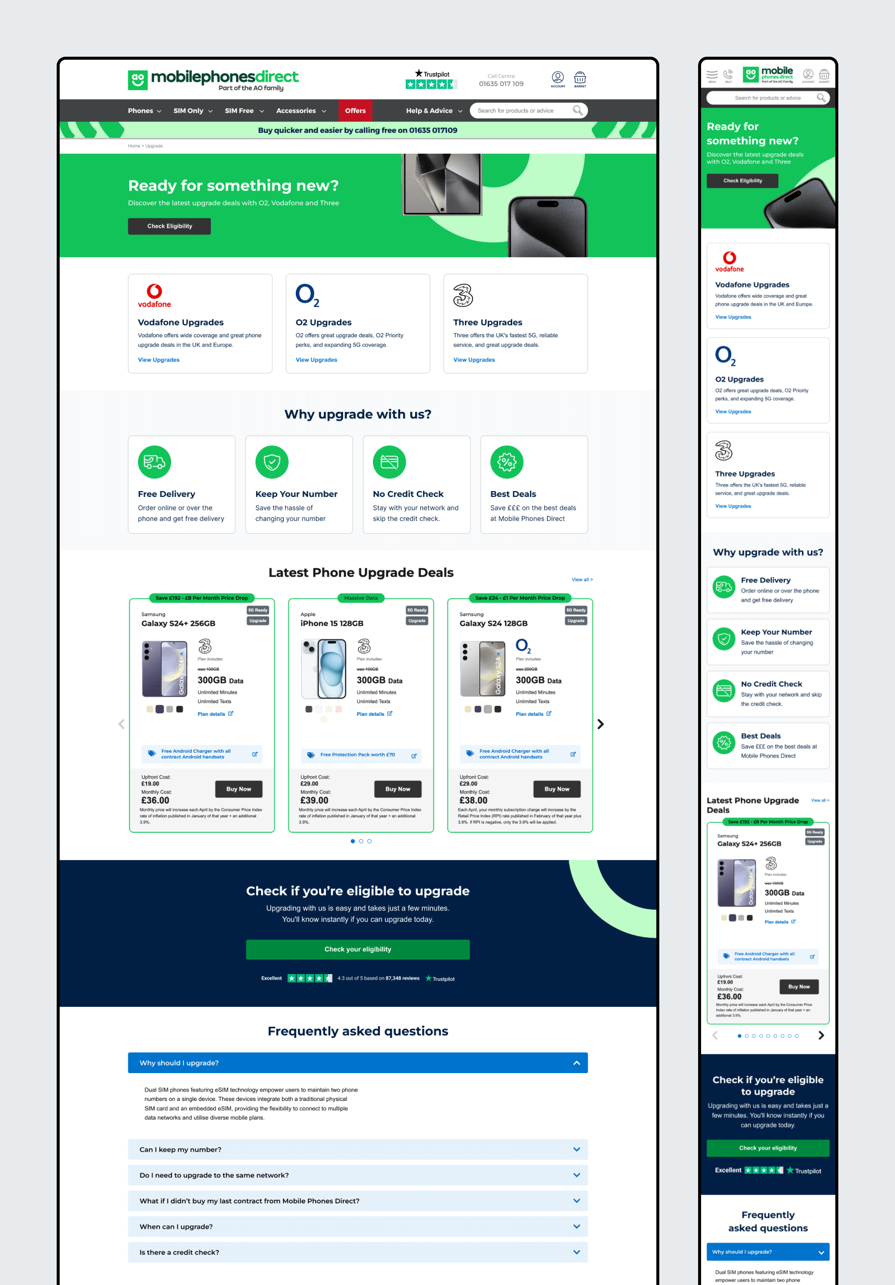
Landing page desktop and mobile designs
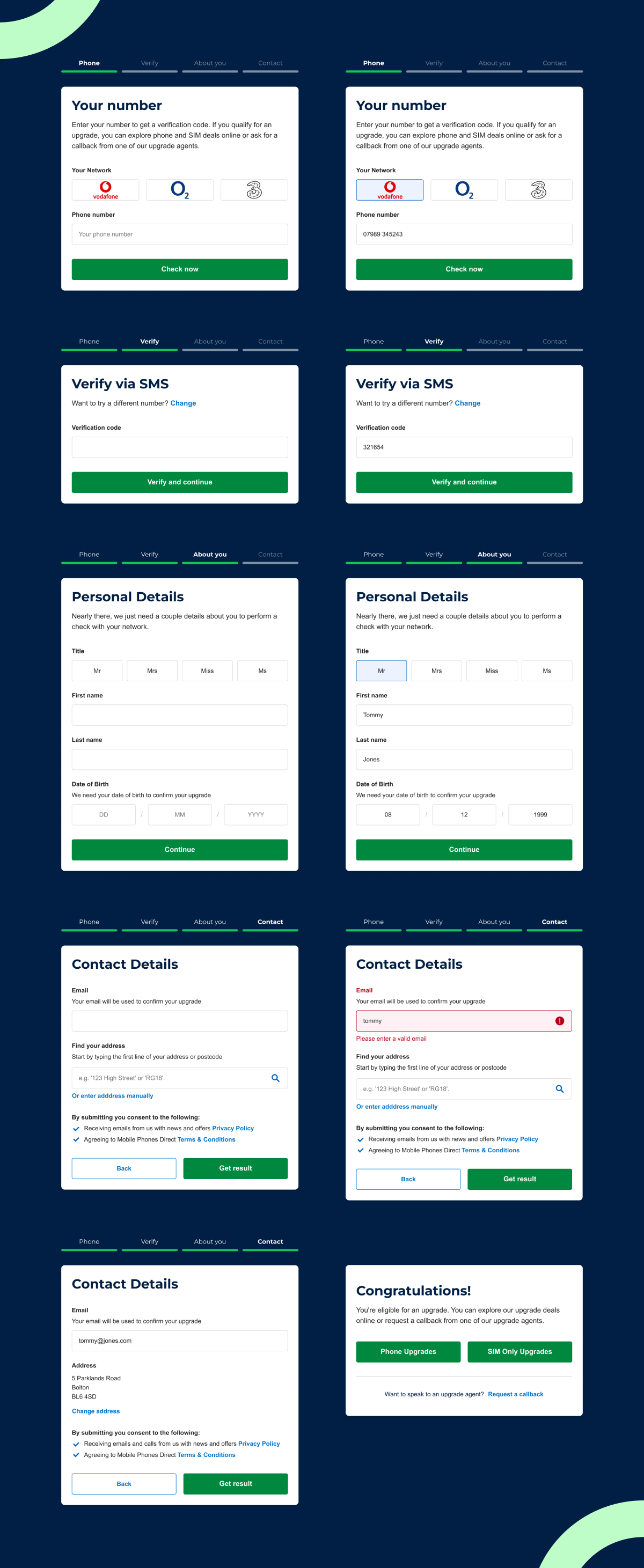
Upgrade eligibility checker designs for desktop
Upgrade eligibility checker designs for mobile
Want to work together?