The challenge
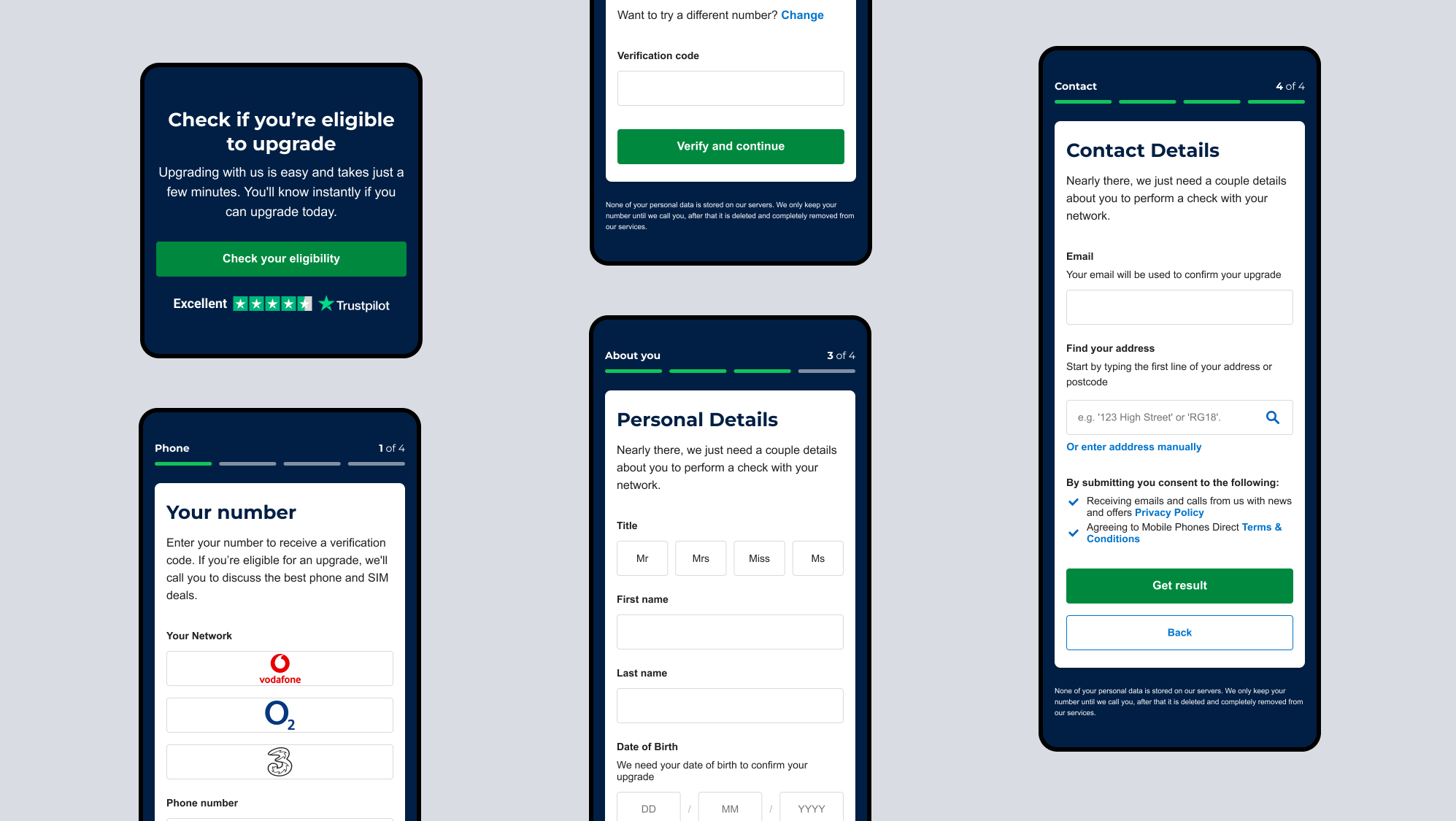
Improving conversions through the form and reducing tickets to the helpdesk. Analysing the current form showed evident pain points such as the form being clunky, fields confusing and the layout jarring.
The solution
Created a more simple, inclusive form. A multi-step structure logically grouped, easy to comprehend, and with a clear pathway for completion. Improved error feedback with inline validation and validation summary.
Before
After
Other screens
Want to work together?

