
The challenge
Selling more tickets for the CropTec show. In-depth evaluation through audits, interviews and surveys highlighted the navigation was clunky and the aesthetic of the site was jarred.
The solution
Establish user journeys for the different sets of users, using this to architect an improved sitewide navigation system. A clean approach to design of the site consistent with all elements of the brand identity. Overall, creating a smooth experience from visiting the event to exhibiting at the event.
1 — Empathise
Stakeholder interviews
I held extensive interviews with key stakeholders to have a clearer understanding of their issues with the digital experience we offer customers and and suggestions to alleviate any problems our customers might face.
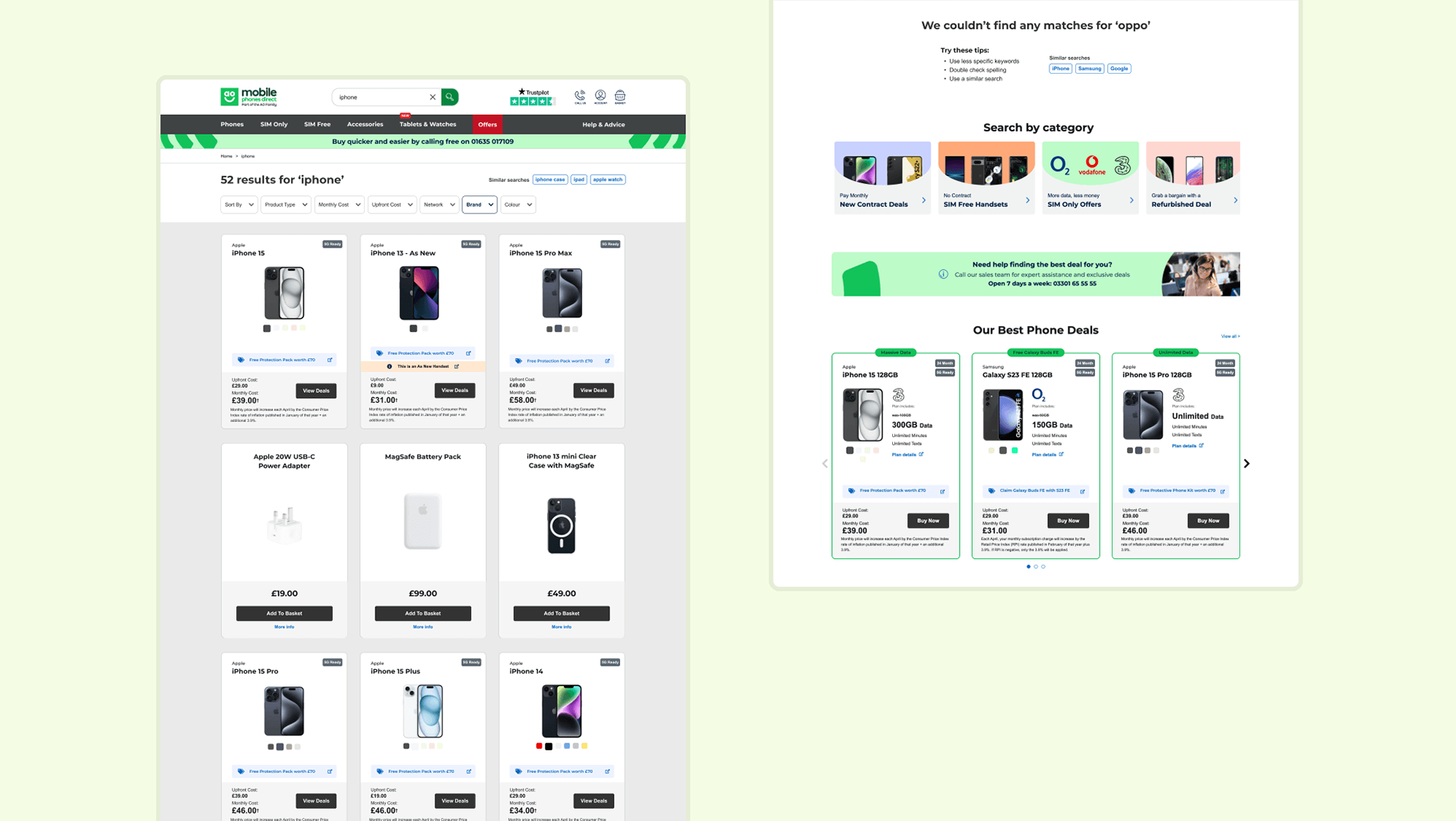
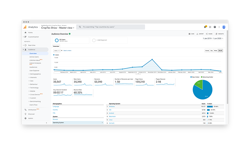
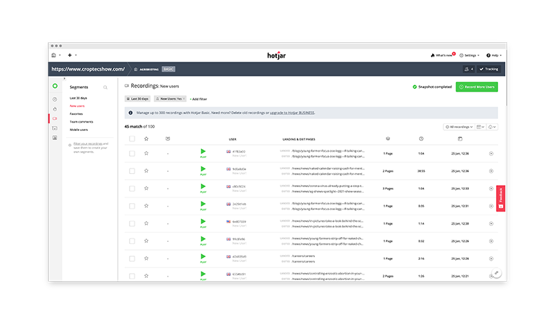
Analytics tools
I analysed data from Google Analytics and Hotjar to learn about our users behaviour and any common patterns. I understood there were two different types of users - exhibitors who want to exhibit at the event and visitors who want to visit the event.
Surveys
I surveyed both types of users separately to establish their feeling towards the experience they've had with the show and how we can improve our website so it better accommodates for their needs.
2 — Define
Architecture & journeys
One aspect the website was lacking was a fluid journey for users. I gathered all present information and pages we had and in communication with the stakeholders, merged, removed and cautiously laid out what will be on the site going forward. It was important to avoid an overload of information and excessive number of pages.

3 — Ideate
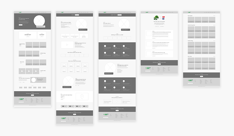
Sketches & wireframes
I used sketches to save time and illustrate ideas in my head stemmed from previous research. In order to cement the structure and overall look and feel of the site, I designed product screens to showcase content, functions and features through wireframes.
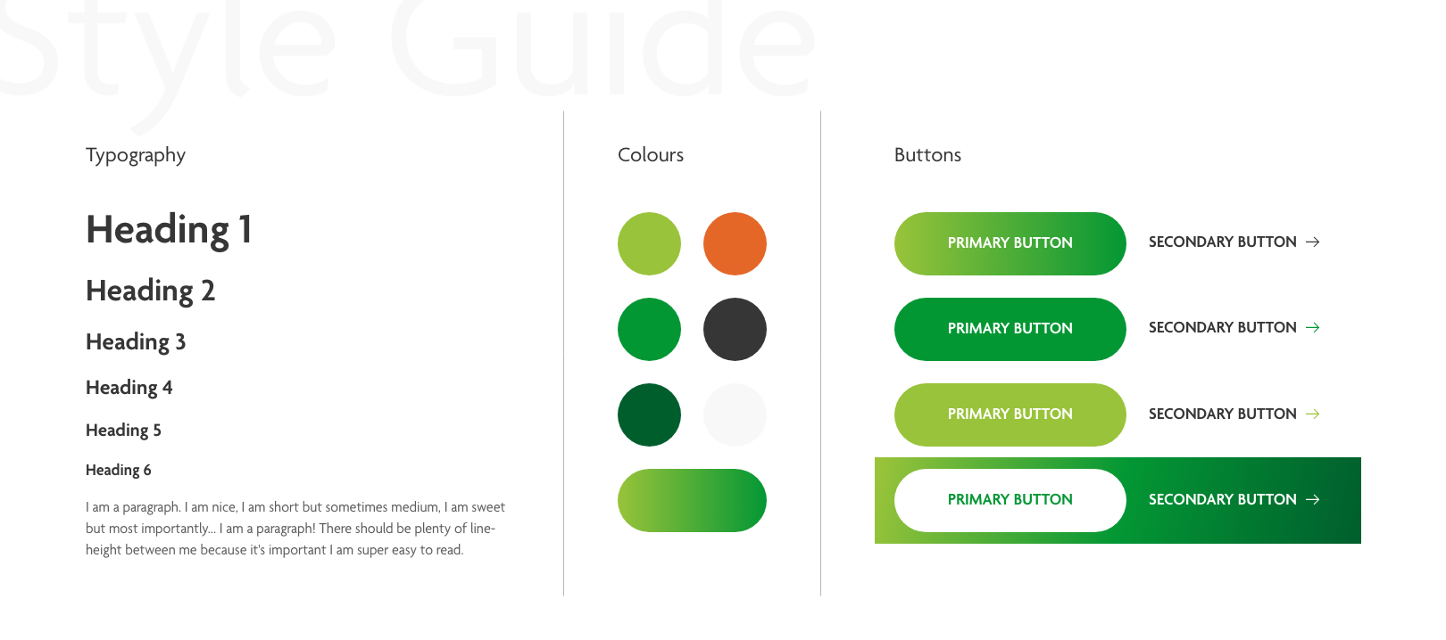
Style guide
A noticeable issue with the website was the inconsistency with colours, typography, text sizes and buttons. I created a style guide in aid of uniformity and a coherent approach when adding the visual design to wireframes.
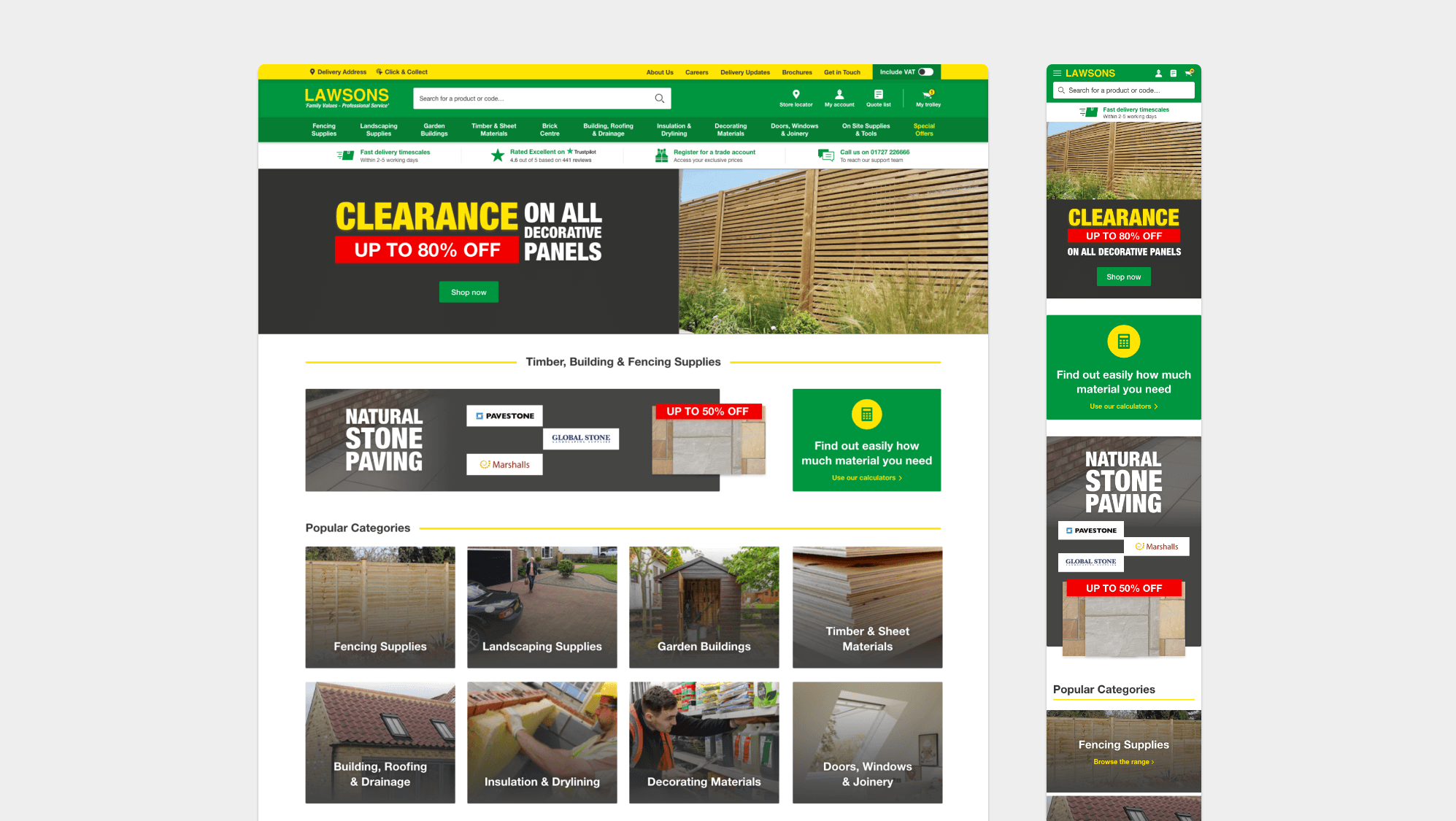
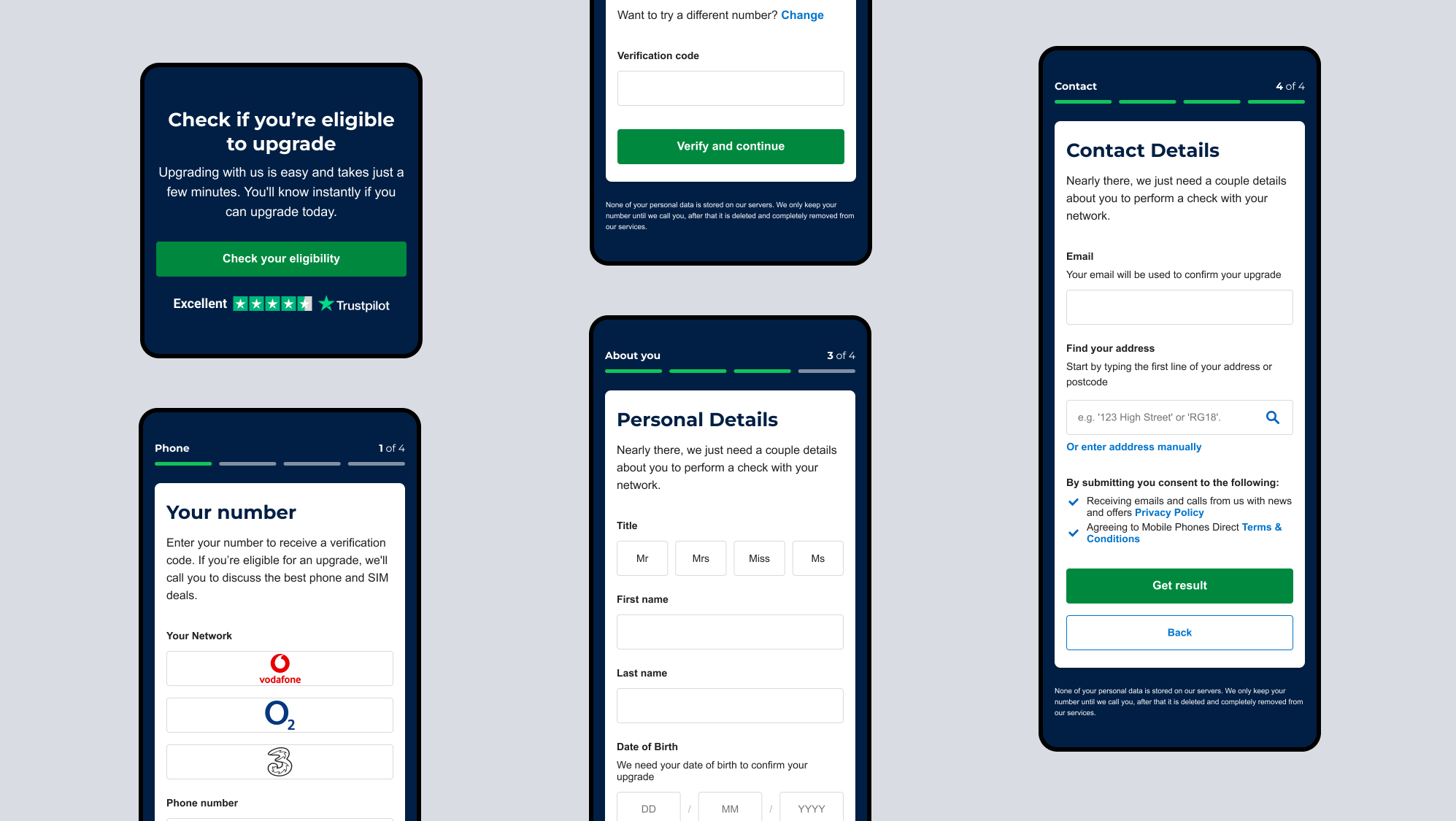
4 — Prototype

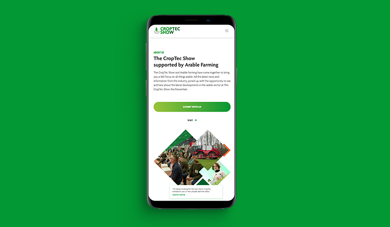
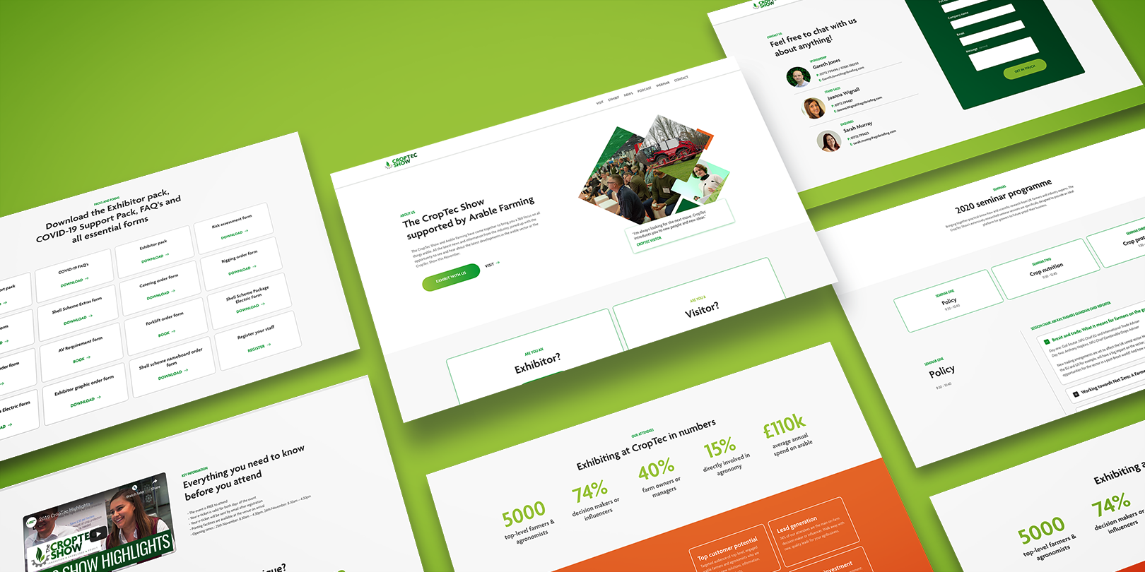
Responsive design
With a good amount of traffic likely to be coming from mobile especially on the day of the event – it was important the site was prototyped for various touch points to ensure a consistent user experience.
Want to work together?