Redesigned the PDP to guide, not overwhelm
Built and shipped a working coded prototype ahead of dev handover
Positioned to cut decision overload site-wide, with an A/B test lined up

The finished journey, start to finish on mobile.
1 The problem
Every decision presented at once
The idea didn’t start as “let’s redesign the PDP.” It started with a smaller, separate project: introducing bundle deals, where an accessory like earphones could be added to the monthly plan cost instead of paid upfront. Slotting that into the existing page made something obvious — the PDP was already asking customers to process colour, storage, contract length, data, price, future pricing and offers all at once, before we’d even added anything new.
That observation became the brief: was presenting everything simultaneously actually the right approach? The research that followed made the case, and the project was approved onto the roadmap with a projected return in the low six figures annually, modelled by the ecommerce and insights teams.
Success meant two things: usability evidence that a guided flow reduced the decision-making load of the old page, and, once it reaches production, a measurable shift in completion.

The existing PDP with key decisions.
2 Research
The data and the benchmark pointed the same way
Before designing anything, I commissioned an analytics audit of the existing PDP from Contentsquare and briefed their team on what we needed to understand. Alongside it I ran a benchmarking study putting our page side by side with Apple and Google — both guide customers through the same decision step by step rather than presenting it all at once.
Contentsquare mobile sessions, sampled Oct - Dec 2025.
Together with the benchmark, that produced the hypothesis the rest of the project tested: revealing one decision at a time would reduce the load of the current page without making the journey feel longer. Several of the audit’s recommendations map straight onto the final design — condensing the sticky bar, making plans easier to compare, and fixing a trade-in exit that dropped customers back onto the PDP to add to basket a second time.
This was the only research that ran ahead of design. Everything after it was designed first and tested second.
1
Contentsquare analytics audit
2
Competitor benchmarking
3
Wireframes
4
UX team & stakeholder review
5
Visual design, all breakpoints
6
Two usability tests
7
Comparison vs current PDP
8
Dev handover
The plan I set out at the start, and the order the project actually ran in.
3 Wireframes
Structure first, then the visual layer
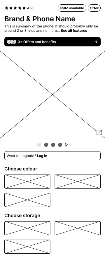
Wireframe
Structure and flow only — unstyled on purpose, so review landed on the sequence rather than the styling.
Early visual design
The same screen with the visual layer applied — one of the versions that went into testing, not the one that came out of it.

4 Usability testing
What changed because of it
Two rounds of unmoderated testing ran on the visual designs — ten participants each, recruited through UserTesting — putting the alternatives I’d built directly in front of customers. A third ran the same way once the design was agreed, comparing it against the current PDP — those results are in Impact.
Testing wasn’t a rubber stamp. Several decisions changed direction because of it, and a couple came back closer than I expected.
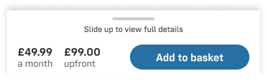

Collapsed, and expanded sticky bar
A sticky summary bar, unanimously
All ten testers preferred a sticky bar holding the price and the add-to-basket button over a static one. It kept the total and device details visible wherever they were on the page, which let them compare their selected plan against others without losing their place. One tester: “You can’t miss this and it’s very clear to understand the full total.”
Named colour tiles over swatches
All ten preferred larger, named tiles — including when the name wrapped onto two lines, which was the trade-off I’d been worried about. The reason was accessibility as much as preference: swatches are hard work for anyone with colour blindness, and for everyone else silver and white are close enough to need the label. “I can see what the name of the colours are… so that I don’t pick the wrong thing.”

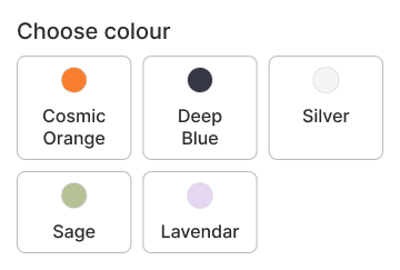
Colour swatches vs. colour tiles


“Add to basket” beat “Continue,” 90% to 10%
“Continue” created mixed expectations — testers weren’t sure whether it led to a summary, the basket, or straight to checkout. “Add to basket” gave explicit confirmation the item was saved, which let them feel secure before either paying or adding something else.
Two calls the data wouldn’t settle
60% preferred autoscroll after each selection. It didn’t save any time, and testers knew that — “it makes me feel like it was faster even though it was the same amount of time.” A few found the jump unexpected and scrolled back up.
One page versus two came back an even 50/50, with testers on both sides scoring it easy to use and everyone happy with the length of the page. Neither result is strong enough to design on permanently, so both are flagged for an A/B test rather than settled by a designer’s best guess.
Autoscroll after each selection
60%
40%
One page vs two pages
50%
50%
Autoscroll and the one-page layout both shipped, both queued for a test.
“I thought it was just right because you were guiding me through the steps. I don’t really feel it was too long.”
5 The design
One decision at a time
The new PDP breaks the decision into six steps. Each one is visible from the moment the page loads, but only one is open at a time — the rest sit collapsed until the step above them is answered. The order of the steps, and which ones gate which, came out of the research and testing above rather than being layered on top. What happens when someone goes back and changes an earlier choice was a harder question, and the design file never answered it — that’s the next section.
1
Colour
2
Storage
3
Plan
4
Trade-in
5
Accessories
6
Add to basket
Answering a step unlocks and scrolls to the next. Trade-in and accessories can be skipped.
A variant of the flow adds a bundle step before plan, carrying the choice through to the plan details and the sticky bar. That’s the piece that started this project, but the trading team run bundle deals infrequently enough that the main journey doesn’t depend on them.
Old PDP
Colour, storage and plan all pre-selected on entry
Trade-in is a separate modal at add-to-basket
Accessories require scrolling to find

New PDP
Guided, one decision at a time
Plans can be filtered, not just scanned
Trade-in is its own step, not a modal at add-to-basket

6 Coded prototype
Pressure-testing the logic before handover
The Figma file was complete, but a Figma prototype only shows one path through the page. This PDP is a sequential configurator — six steps, each unlocking the next, with dependencies that run in both directions. Most of the tricky states are reached by going backwards: changing an earlier choice after later ones are already made. That shape can’t be fully drawn in Figma, and most of it had never actually been defined.
So, ahead of dev handover, I built a working, responsive prototype of the full journey, verified across four breakpoints in a real browser. No one asked for it — but with Claude licenses newly rolled out across the team, it was an obvious way to find out what the design file couldn’t tell us.
Developers have since used it alongside the static designs as a working reference: rather than cross-checking a dozen frames to see what a given combination of options should look like, they can select those options in the prototype and see the result at any breakpoint.
It surfaced questions the designs hadn’t answered.
What happens if you change colour after everything else is already configured?
I resolved this as a full reset back to storage — but it’s genuinely arguable. The alternative, keeping anything still valid, is kinder to someone changing their mind late in the process. I’m presenting it in dev handover as a considered call rather than a settled one.
What should happen when a storage change orphans the chosen plan?
Changing colour resets everything below it; changing storage doesn’t — and storage can orphan an already-chosen plan, since plans vary by storage size. That state appeared in no screenshot and had no defined behaviour before this.

7 Impact
Results so far
The last round of testing put the finished design head to head with the current PDP.
The designs and both prototypes have been presented company-wide, and the reaction has been positive — described as a much-needed improvement, with real appetite for seeing it tested. It’s now in development, with an A/B test against the current PDP to follow.
I don’t have live outcome metrics yet, and I’d rather say that plainly than dress it up. What I do have is a decision backed by testing against real customer behaviour, built with enough rigour beforehand that the open questions reaching development are the hard ones — not things that should have been caught earlier.
8 Reflection
What I’d do differently
Moderated testing, if time allowed it. Unmoderated gets you the numbers but not the reasoning behind them, and on the two results that came back split I’d have learned more from watching. I’d also bring the coded prototype into the process earlier next time; several of the behavioural questions it surfaced could have shaped the wireframes rather than being resolved after visual design was already underway.

